Fashion Forecast Project
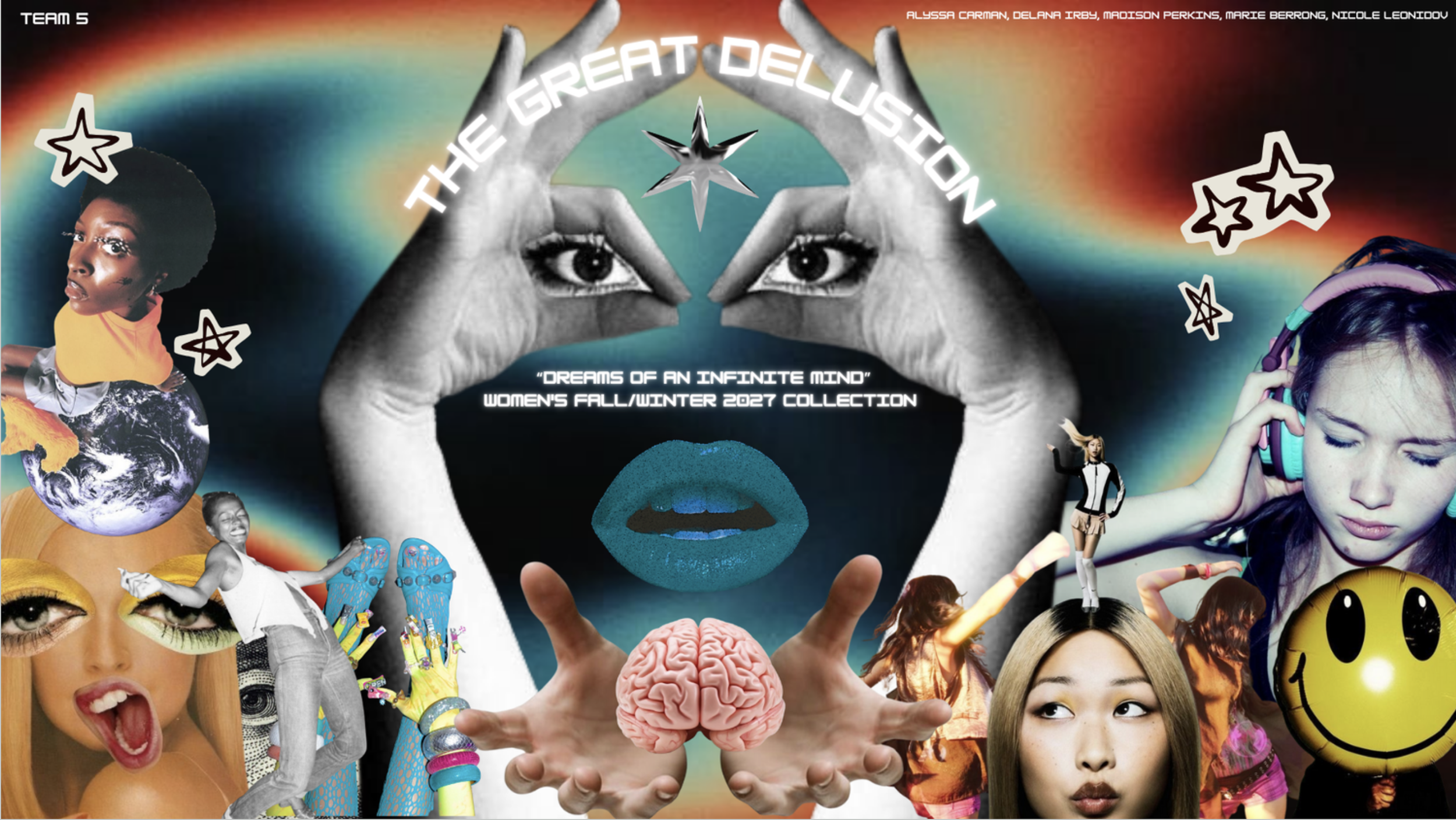
“The Great Delusion”
The Team
✳︎
The Team
✳︎
The Team ✳︎ The Team ✳︎
-
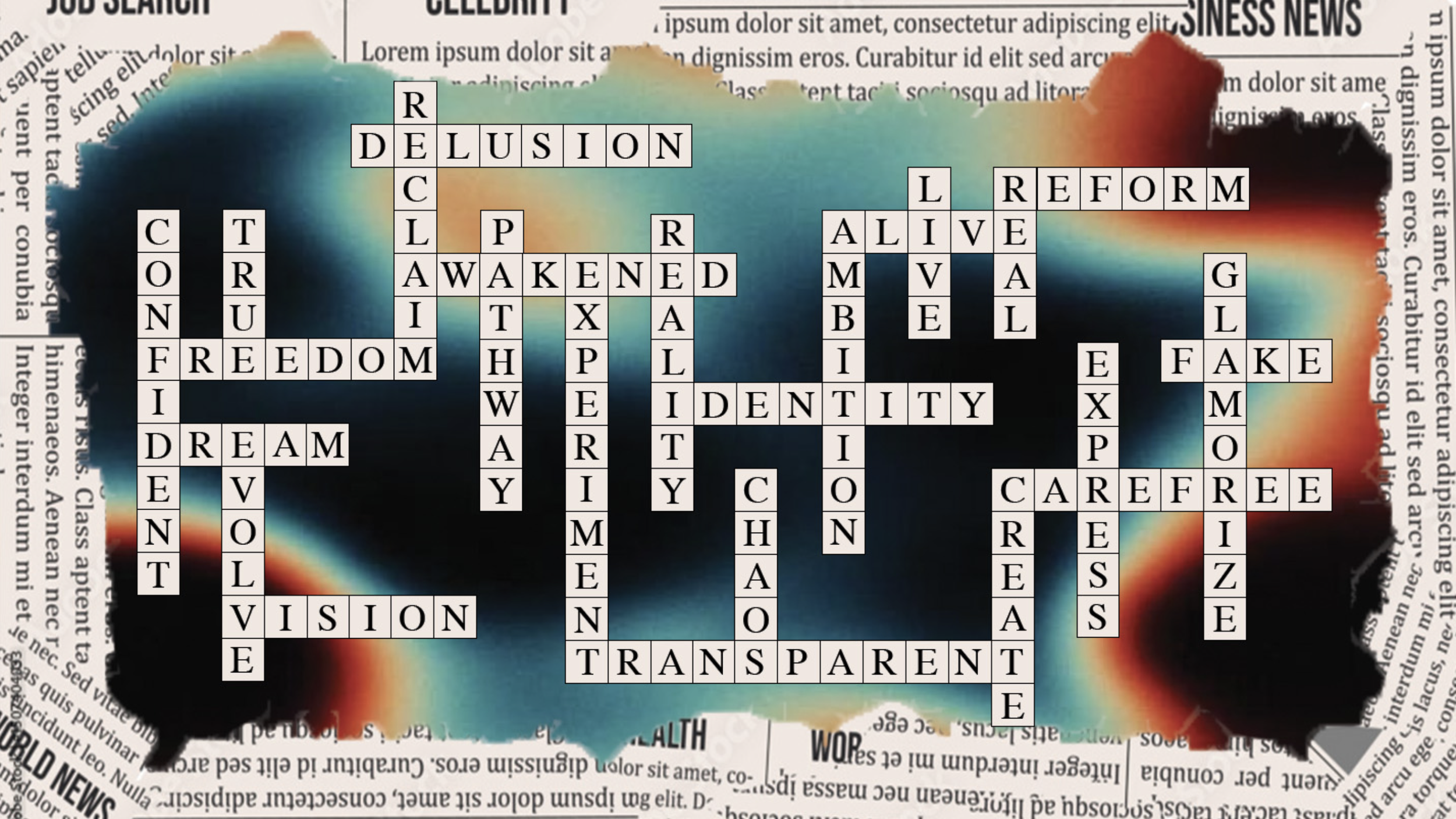
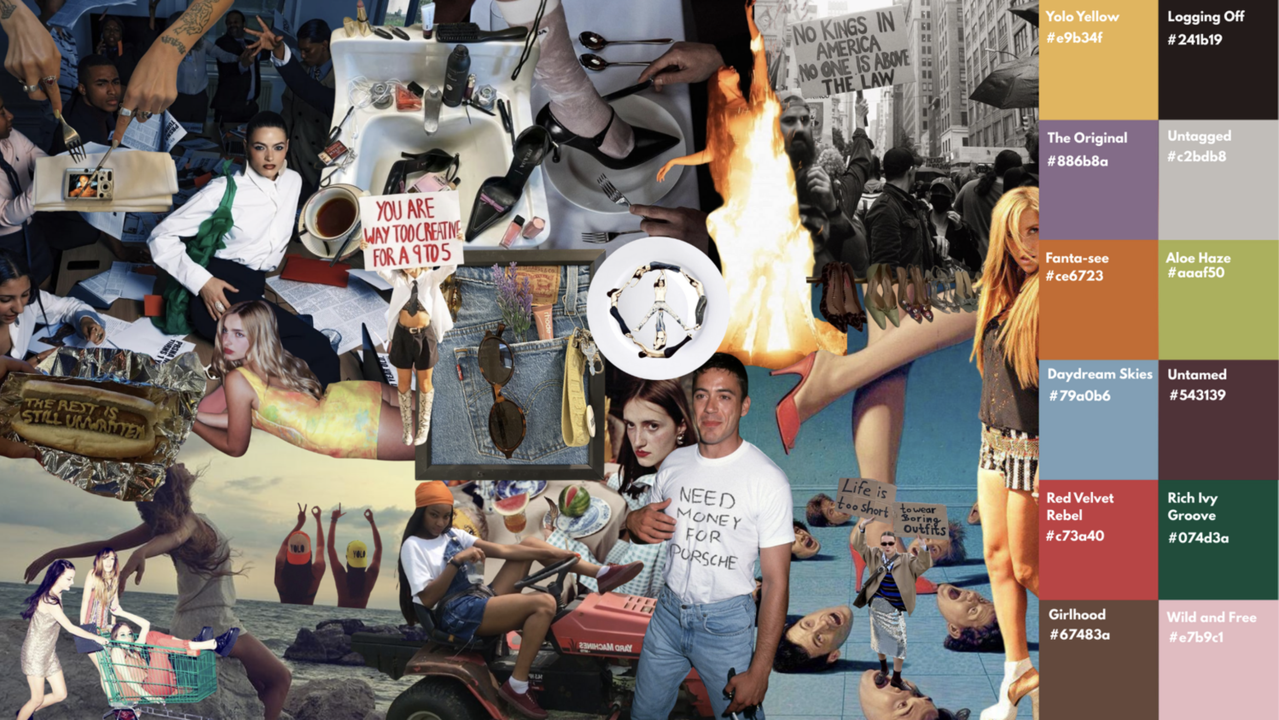
The color palette is what my team and I would call a muted or refracted rainbow as people are bending their realities from the reflection of the times, feeding themselves promises and concepts that are pleasing to their standards or ways of living life. With the many different ideologies and morals going on in this country, clashes are inevitable. The similarities of both sides are is that both are overwhelmed with the events going on in this country and all over the world. People have began to create their own world and live life the way they want to despite what other people may or may not think.
-
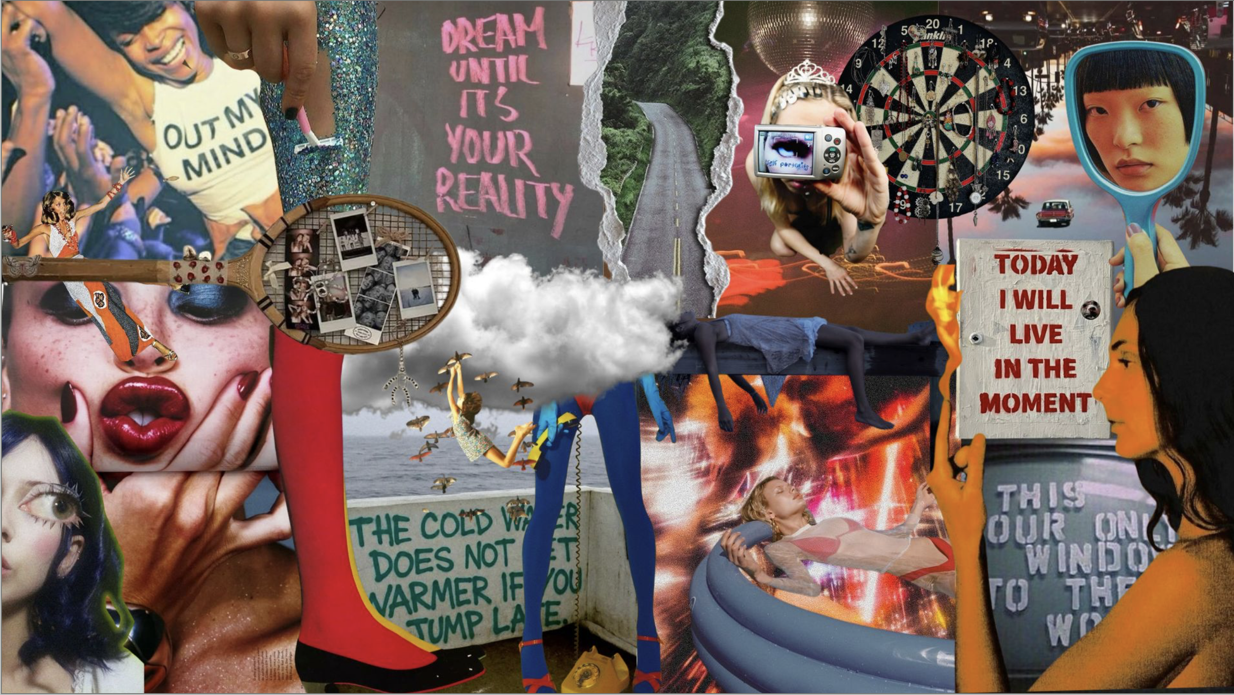
This Story Palette goes in the form of a delusion where people begin to relive the best moments of their lives in order to fake the funk during overwhelming situations. We channeled the early 2010s Los Angeles aesthetic because of the nostalgic and carefree vibe it gives off. The majority of the colors are related to the color scheme used during that time. It was a filter used on Instagram and Snapchat that people would put over their pictures of themselves, friends, families, and any moment they wanted to cherish. Many people have begun to act as if they were living during this era to cope with the overwhelming changes happening in the world. People have reverted back to the music, fashion, and even behaviors during that time to remind themselves that there's still good things that can happen in this world and that the present isn't going to stop the future from producing good experiences.
-
We settled for these groups of colors because of their bright nature and their correlation to our team's theme of an optimistic yet chaotic style of delusion in a black and white world. With the economic state of the country, we chose Aloe Haze and Rich Ivy Groove because green represents wealth, and many people in this country are using the economic climate to push themselves to work harder to obtain the things they want in life. It's also pushing people to become entrepreneurs to find their own way to make money. We chose red to represent the constant activity people have indulged themselves in, to forget about the reality of the world and their own personal reality. We also used this color to represent love as people are seeing the importance of it in this day and age, so they spread this feeling carelessly in means of trying to repair a broken world. Yellow was also included in this palette as a means of people choosing peace or deciding to be happy, even though they know there are a lot of tragedies and issues going on. Blue is used to represent people's loyalty to their own ideologies and morals during this day and age. People will believe what they want to believe, see what they want to see, and hear what they want to hear. Lastly, we used orange in this color story to convey people's obsession with good health pertaining to physical aesthetics and the paranoia of health care services. People have found out different ways to care for themselves that won't break their wallets and won't have any negative side effects. Overall, this color story shows how people have noticed the changes in the world, and they chose to create their own haven to protect their minds from the rapid changes that are taking place. Things like going to parties, traveling, hanging out with friends, indulging in different genres of fashion, or just doing things out of impulse.
This form of delusion is closely related to DID, which is Dissociative Identity Disorder. Both can be a defense mechanism your brain creates to combat overwhelming and traumatic experiences.
Graphic Design
Delana Irby
irbydc@vcu.edu
Alyssa Carman
carmanal@vcu.edu
Brainstormming
We referred to the first project assigned to us in this course, which was about finding the zeitgeist and predicting how life would be in the next 2 years.
THE TEAM thought about THEIR INDIVIDUAL EXPERIENCES and what things we’ve seen in real life and in mass media that SHOW what type of shifts society and the fashion world are going towards.
Marie Berrong
berrongnm@vcu.edu
Madison Perkins
perkinsmr@vcu.edu
The Ask
cOLOR tHEME
TECHNICAL sKILLS
Desgin Choices
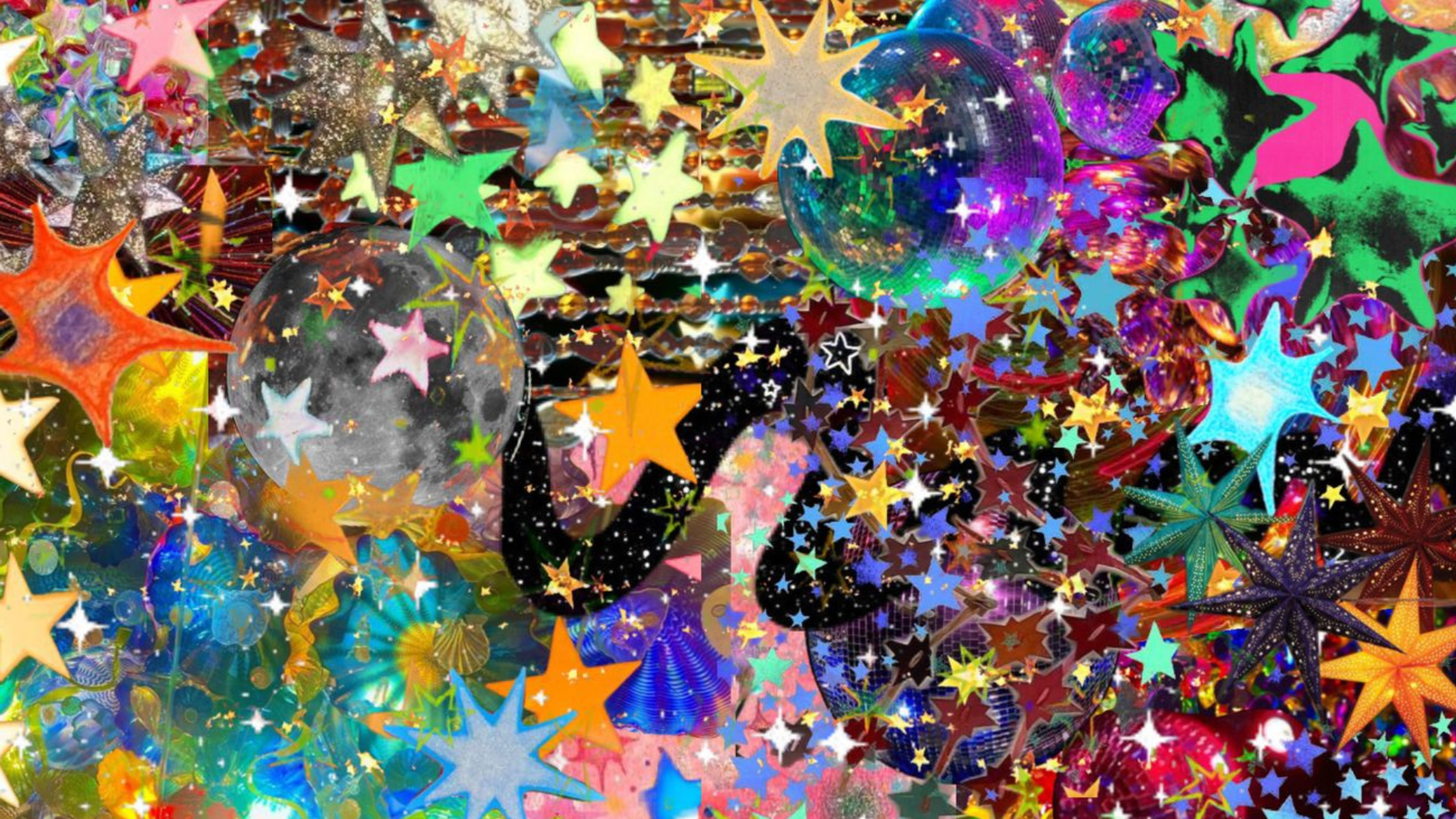
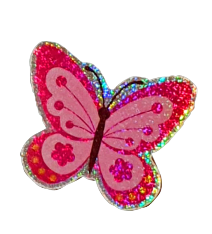
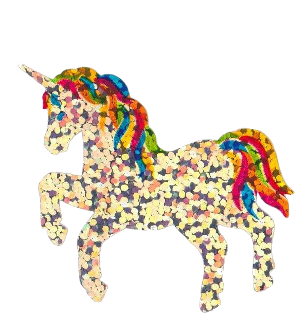
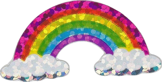
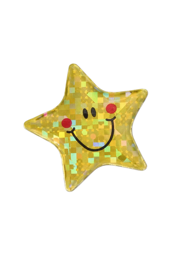
I was in charge of creating majority of the slide deck design. Once we got the main theme down, I took some keywords like dream, free, creative, nostalgia, and self-expression to conjure up the design. The main slide is the rainbow aura slide. I chose to do that because it gave off the vibe of having you mind somewhere that caters to your likes and interests, basically a dream. I then used a lot of other elements that had more texture added because I also wanted to translate the abstract philosphy we had added to our prediction. The overall slide deck was designed to give off the feeling of a daydream. A place where you do what you think is best for you and doing anything in your own way.
Skills
Analytical Skills
Brand Literacy
Nicole Leonidov
leonidovnm@vcu.edu
Research and analyze the current trends of society and past patterns to create a PREDICTION of what fashion and the world would look like in 5 years.
The Process
〰️
The Process 〰️
Research Elements
While conDUCTING RESEARCH, WE TOOK INTO ACCOUNT THESE KEY DRIVERS THAT USUALLY SET OFF TRENDS IN SOCIETY: Social Media, pop culture, politics, and economics.
teamwork Skills
Research
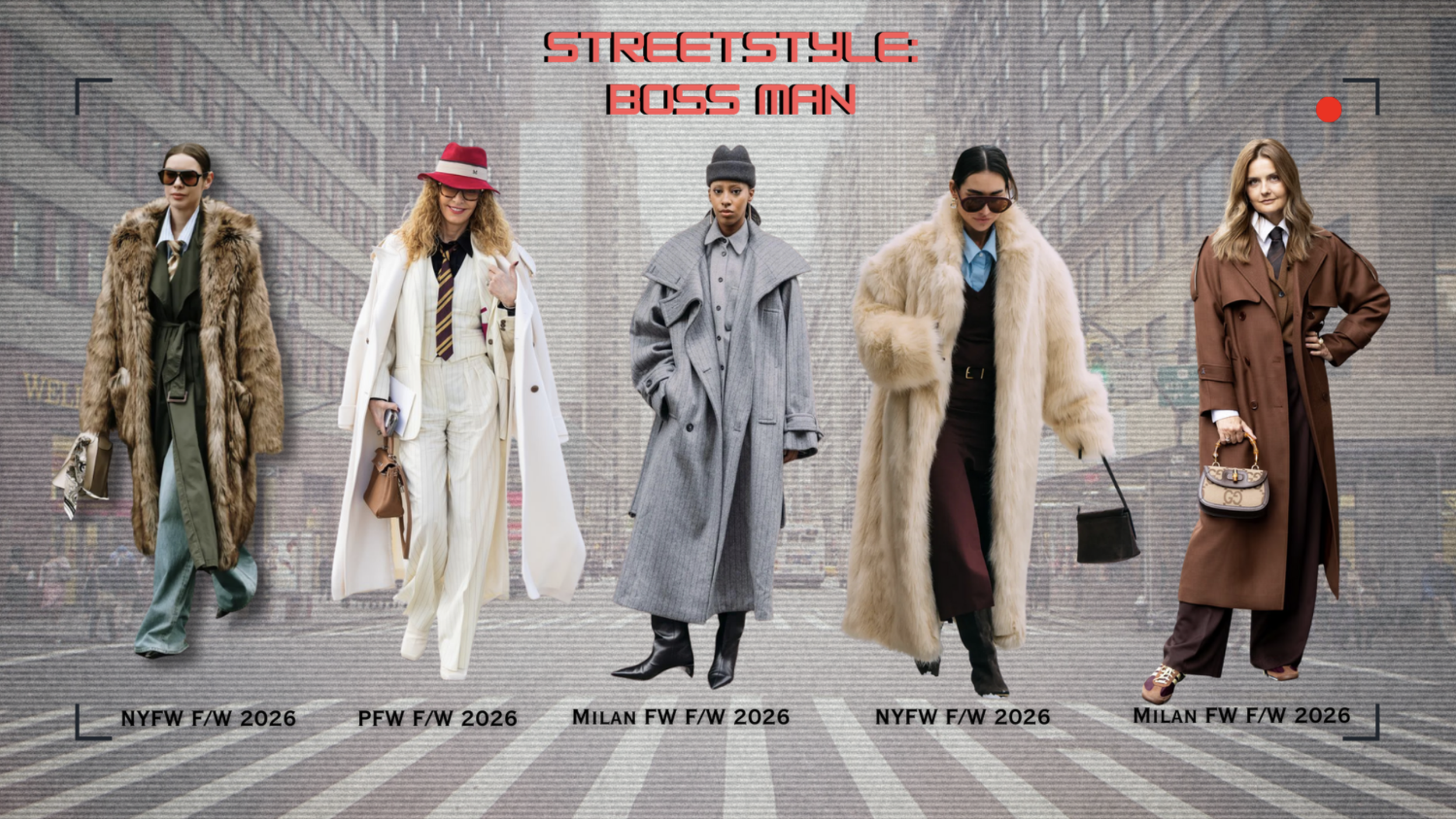
Fashion Elements
The thought process for the fabrics and looks, we wanted each element to align to the main idea of the prediction which was that in the next five years , Majority of society would be stuck in a state of deluded bliss in which they live only for themselves and not conform to what people deem as acceptable.
-
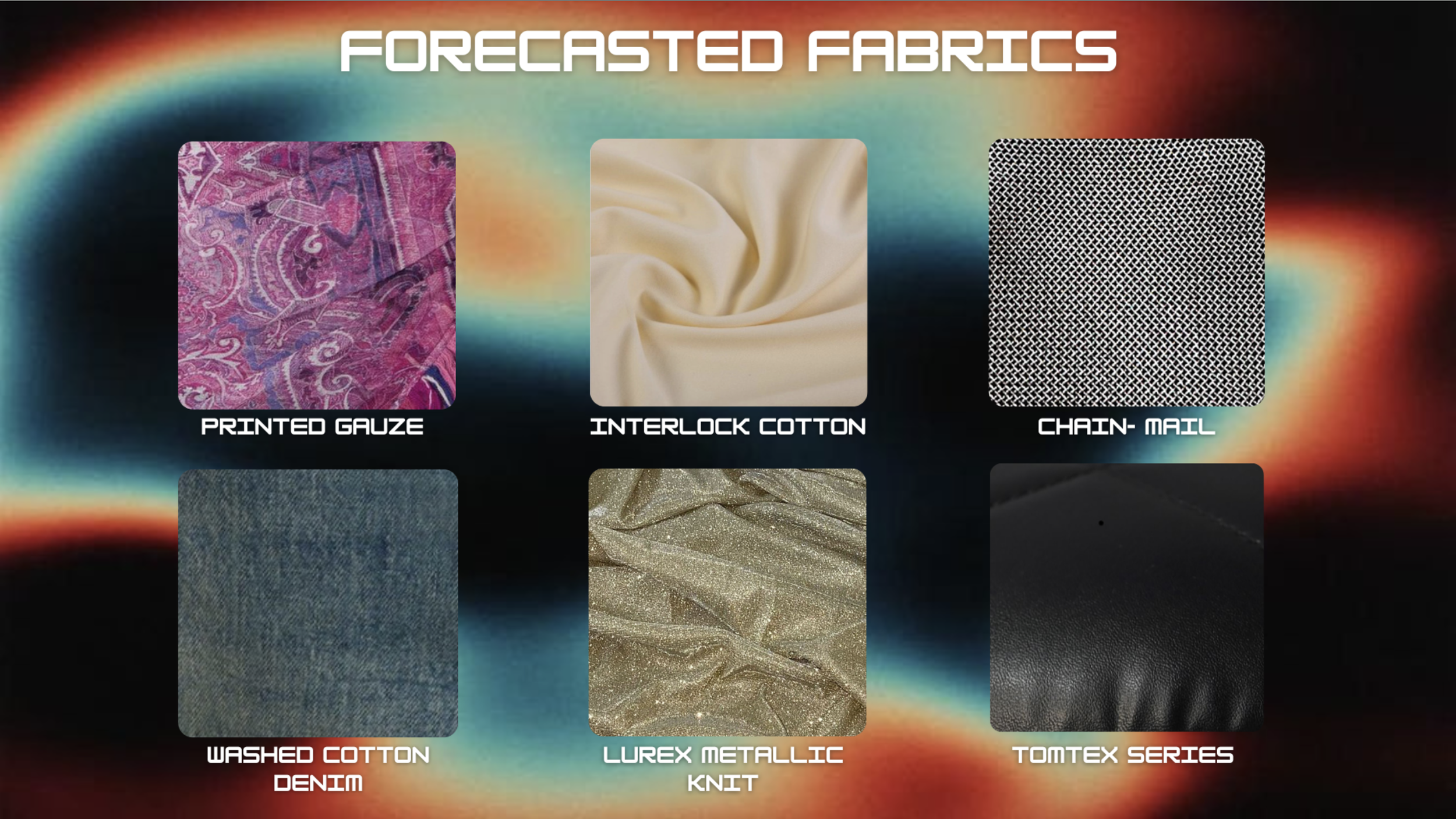
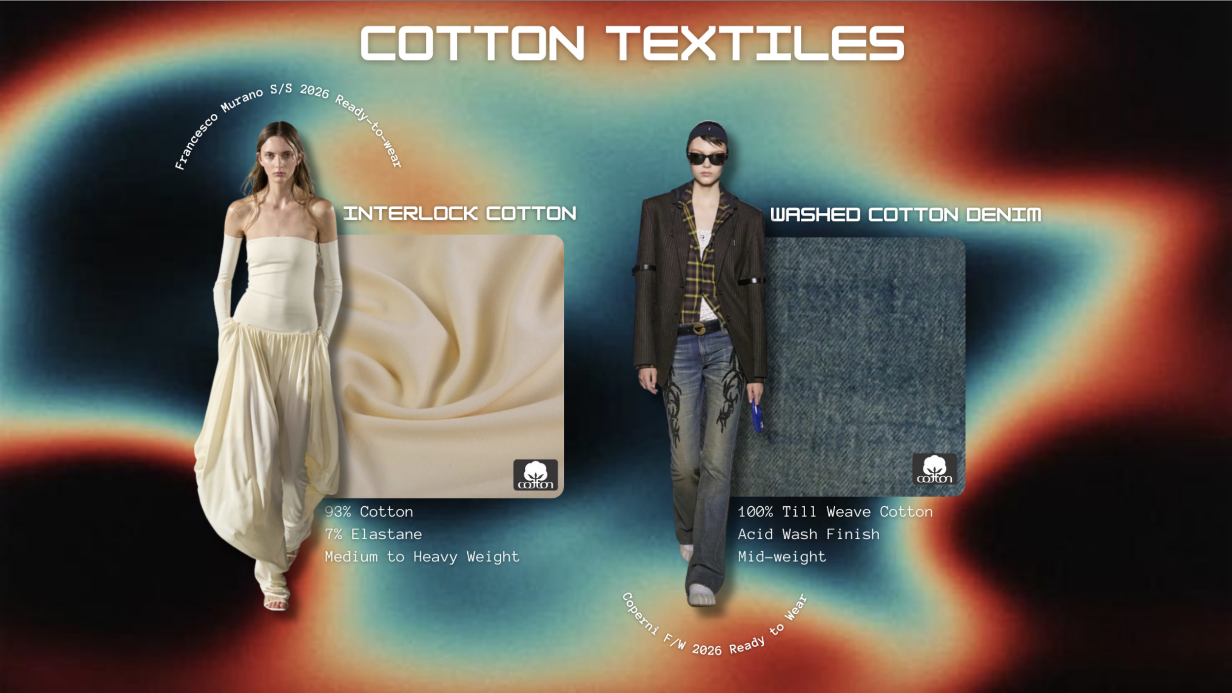
Majority of the fabric was chosen because of the innovative and expressive ways yhat designers used the fabrics. We also chose a lot of the fabircs that were flexible and comfortable since we said that a lot of daily activites being done during our prediciton would be fitness. This is because we predicited a lot of people would start their fitness journey to take care of their health and well-being.
-
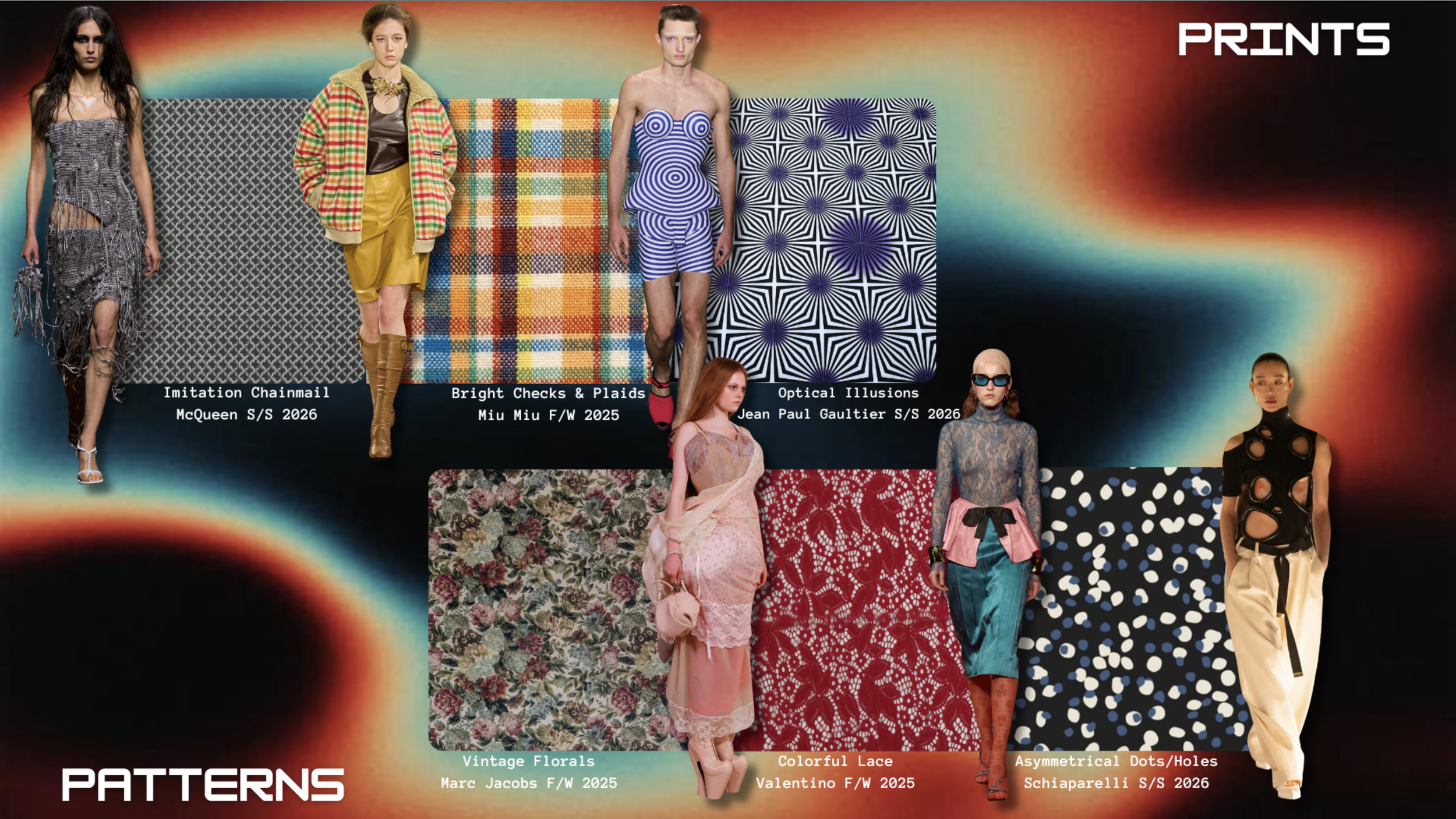
For Prints and Patterns, our choices reflect both diversions of our color stories and overall vision. For our Prints, we chose imitation chainmail, bright checks & plaids, and optical illusions. Imitation chainmail demonstrates a rebellious and defensive nature of the zeitgeist, and resurrects the image of a warrior into women’s fashion. Bright checks and plaids can not only be an expression of joy and energy through clothing, but they can also be seen as defiant, as plaid is very often seen in punk fashions. Optical illusion prints are another example of this, showcasing a need for self-expression and whimsy during more difficult times. For our Patterns, we chose vintage florals, colorful lace, and asymmetrical dots or holes. Vintage florals, while usually seen in spring, can also be used in a darker tone for this forecast as an expression of a darker climate. Along these lines, the asymmetrical dots or holes are a sign of self-expression in a less energized population that needs a pop of excitement in their everyday wear. Colorful lace can also be used as either an energetic or a darker pattern, but is becoming more popular not only as an embellishment, but also a full fabric.
-
For the trims and details, the selection we chose reflects the perfect compliments of the chaos theme. Fringe, fur, and mirror embellishments embrace the texture, movement, and visual intensity. The elements transform the garments into expressions of slight disorder and freedom. Fringe is in constant motion and has a sense of energy that expresses that carefree aesthetic. The fur adds this dimension through the unique quality, and brings comfort, while also having an element of wildness. Mirror embellishments reflect the idea of glamorizing chaos with the shine and sparkle. The boldness reflects the confidence and individuality. Together, all three of these trims/details embody chaos as a creative freedom due to blending comfort and extravagance.
Final Outcome
Decemeber 2025
Fashion Forecast Presnentation
The final presentation was a success for the group. THOUGH we did not get PICKED for best presentation, the future snoops representative called the presentation “abstract” and THOROUGHLY thought out. This project turned out the way it did because everyone pulled their weight equally. My teammates and I were very determined to get our idea ACROSS and translated in a visual way. The feedback we got from our professor was overall positive. I loved working with this group, and I loved the challenge that came along with this project.